Look! Mobile Legends New User Interface
What’s up Mobile Legends Players, great news for everyone! For those who like Aesthetics and Design to please their eyes, for those who like seeing things more organized and neat. This update is for you, we’ll try our best to explain the new UI update is so sit back and read the User Interface update.
First, let us explain User Interface or UI first. User Interface is the thing that you see in front of the screen. Whenever the loading screen goes off, the one you see in front of your cellular phone is the UI itself. So what has changed?
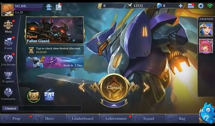
So what has changed? The menu for Store, Live streams, E-sports and others are on the left side and your friends that are online are shown in the right side.
The middle screen consists of types of battle you can play. If you click the Circle in the middle it allows you to choose which game type you would like to play.
The circle changes color for each game type, golden for classic, red for brawl, green for custom, cyan for vs AI, the ranked color isn’t shown yet.
Once you click the custom it shows three options, classic, brawl and draft pick in what looks like a long rectangular button.
Also when you enter a classic game, it allows you to invite 4 more players before you start a match. Friend lists seem different as well.
Your name and logo is still on the upper left side, the upper right side consists of your Battle Points, Diamonds, Messages, Settings and your WiFi Strength.
It doesn’t also show the map anymore but it shows a hero for a certain game type. The brand new UI design will be available this July so be ready for an update.
Indeed, this might cause some lag with all the graphical upgrade they make but if it makes the experience all the worthwhile, why not right? For more updates, stay tuned!
photo: SS via Moble Legends: Bang Bang


Comments
Post a Comment